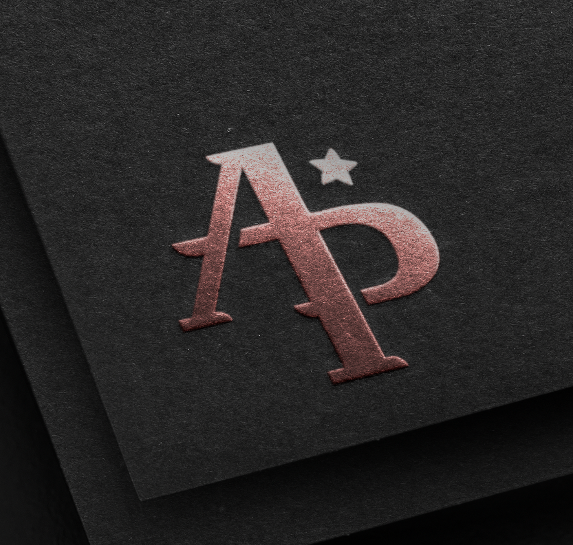
As you can see throughout the website, this is my personal logo. It originated after a few sessions of me doodling the letters A and P, and different ways in which they could come together and be joined to one another somehow. After establishing the general structure, I went into Adobe Illustrator to try and replicate my sketches into something more refined. I had originally played with pre-existing fonts, but even after moving the anchor points and redefining the curves, it didn't really match what I had in mind. Fortunately, in the end I managed to use a grid and draw it out myself, and I'm very proud of how it looks. I believe it captures some of my personality and personal style, and translates really well into multiple different mediums.
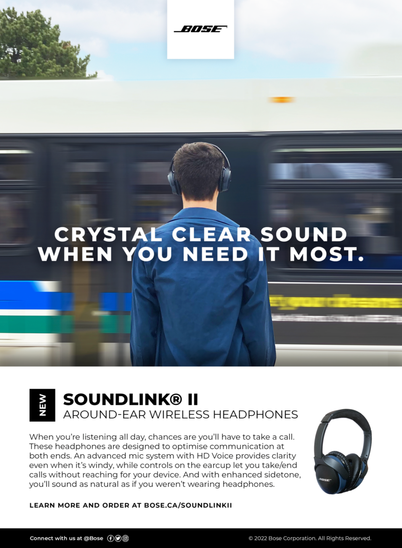
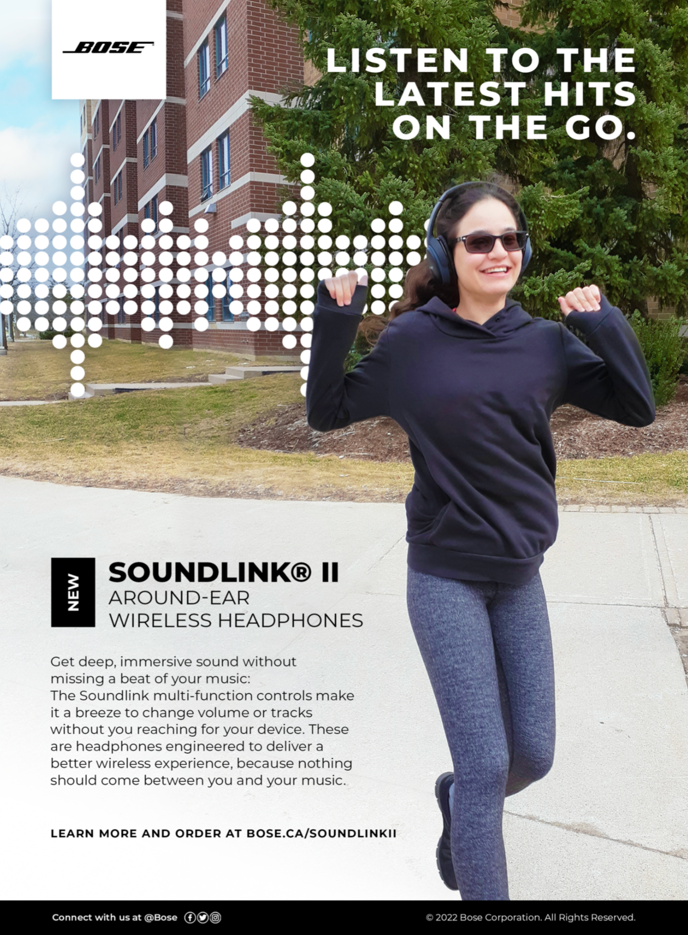
The images below were created as magazine ads for Bose, specifically their Soundlink II headphones. The idea behind this project was to create ads tailored to specific target groups, while promoting the same product. In this case, from left to right, the ads were to appear in Time Magazine, WIRED, and People Magazine. They were all created in Adobe InDesign, with photos taken and graphics created by me. A few edits, like removing the background and adding the motion blur to the bus, were made in Photoshop.
The Time ad had to be serious, tailored to a target audience of mostly professional men, who would be interested in having a reliable pair of headphones for their commute, as well as using them to make and receive calls wherever they are. The WIRED ad was more focused on the technical specs, as the people who read WIRED are more interested in technology. The People ad was made to target women who are into celebrities and pop culture, and would not want to miss the latest releases from their favourite artists. The models are my brother and my roommate.

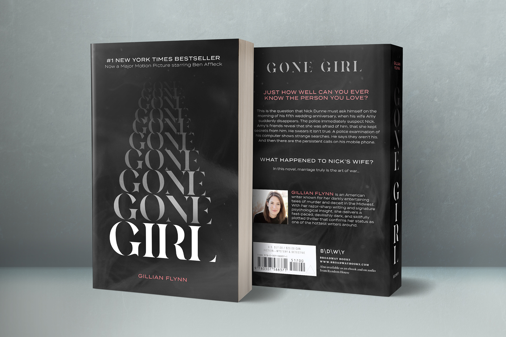
For this project, we had to come up with a cover redesign for an existing book, but instead of using photographs or illustrations, we had to rely mostly on creative uses of typography.
I picked Gone Girl by Gillian Flynn as my book of choice because I had read it recently, and I also figured that the concept of being "gone" could lend itself to some clever typography plays.
I went with a typeface that had missing elements to add to the mystery, and made the word "gone" repeat itself upwards, as it shrinks and vanishes into the background. I replicated the vanishing effect in the spine. Lastly, I created a smoky texture that covered the entire book, and added relevant information in the back, keeping the most important details relevant by using a shade of dark pink to contrast with the background. Everything came together in Illustrator, and I used Photoshop to make a realistic mockup to see how it would look on an actual book.