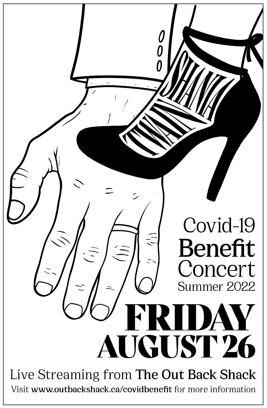
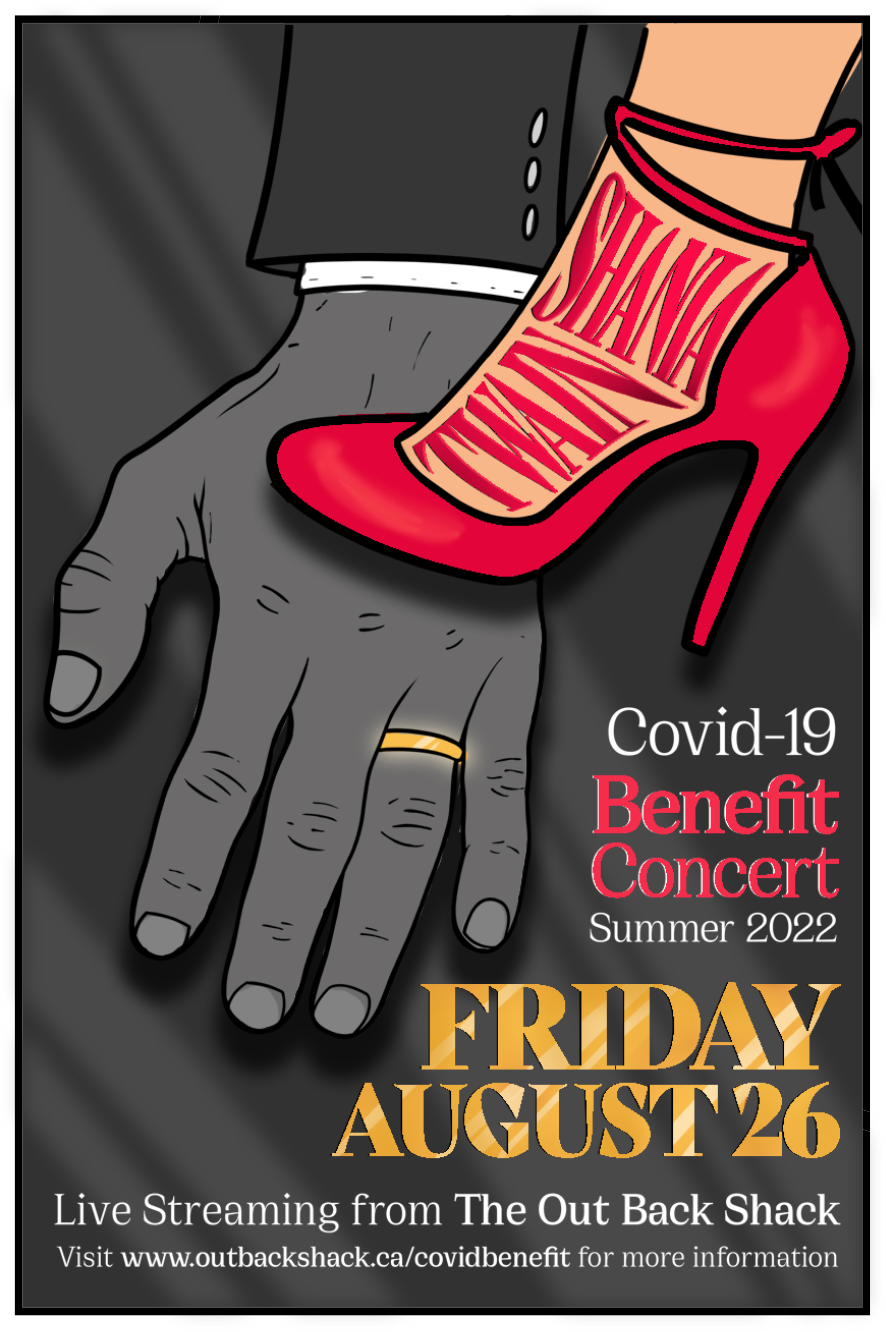
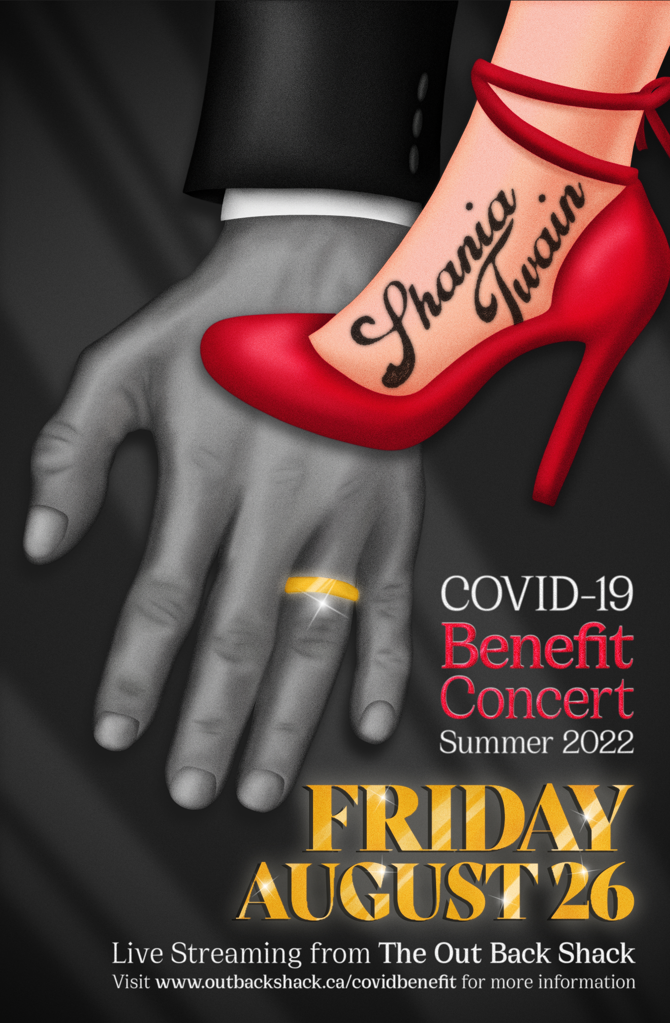
For this project, we were tasked with creating a poster promoting a concert for an artist that had a top charting album during the week we were born. In my case, it was Shania Twain, with her album “Come On Over.” After listening through the entire album, I came up with three concepts that visually expressed the concepts of love, female empowerment, fun, and male-female dynamics.
I then selected the one where a stiletto is stepping over a business man’s hand, because I believe it conveys the concepts in a very clear way, while at the same time leaving the viewer to wonder what the actual story behind the illustration truly is. I wanted this poster to have a film-noir look, with only the important parts being in colour in order to use the contrast to make it more attractive.
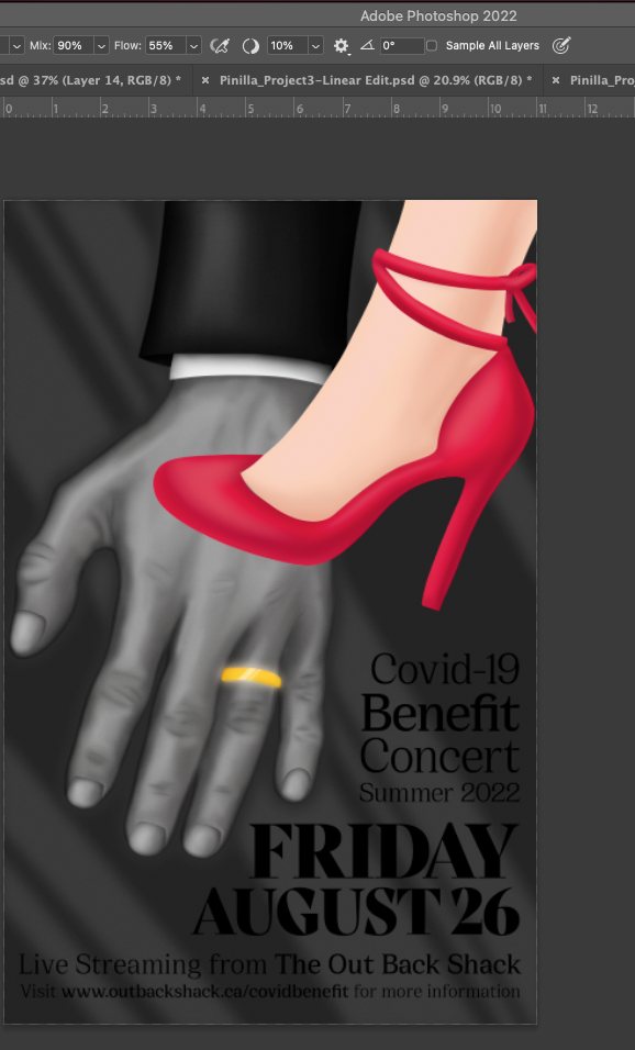
I also wanted it to have an old poster look and feel, so I added a few effects in Photoshop, namely oil paint, gaussian blur, and noise in order to achieve this. Every aspect of the illustration was done with a blender brush, in order to make the highlights and shadows look realistic.
The text is simple and doesn’t take away from the illustration; it complements it by taking colours from it and making the poster harmonious. In the end I gave the background some lines to draw the viewer’s eye to the illustration, as it is the focal point, and then added some sparkles to bring everything together.


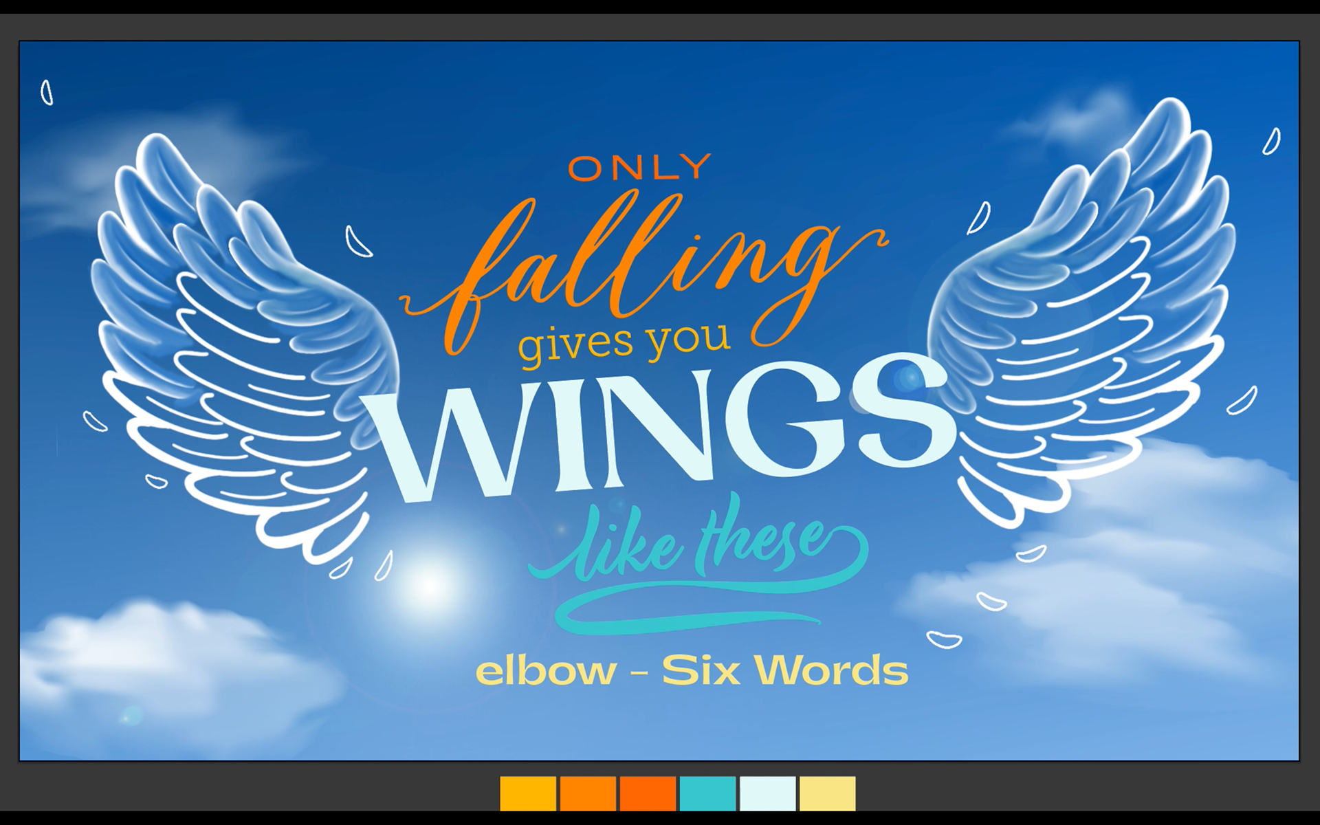
The goal of this project was to pick a quote that we liked and then animate it. My quote came from a song that I really like, "Six Words" by the band Elbow. It is a very motivational quote, as it reminds me that it is through failing, "falling," that we learn and grow, and get our "wings" to fly into better places. I wanted the focus to be on the wings, and planned everything else around them. This meant that I had to draw a sky background with clouds, the sun and a lens flare in Adobe Photoshop. The colours of the text had to match and complement the blues and whites of the background, and the fonts picked had to match one another and the vibe of the song. The text was planned out through a sketch on Photoshop, and then matched as close as possible on Illustrator.
I then brought everything into After Effects and made the text and wings move to the music, along with the clouds in the background and the lens flare. I believe that I successfully matched my vision and created a visual that complements the song in a great way.